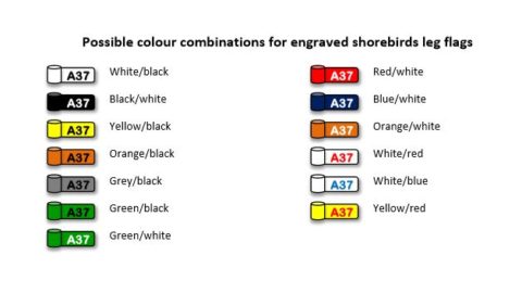
What made me carry out the simple test was the enquiry from our friend and customer who read Spoonbills in Tunisia previously ringed by him. These rings that we had prepared for him were white with black codes. He also read some other Spoonbills which wore black rings with white codes. After that, he wrote to us, “Make for me some white rings with as thick black codes as the black rings with white codes, so that they can be equally readable.” I checked this and it turned out that we were also making the black rings with white codes and they were the same in terms of the size and font pattern; the only difference was the reverse juxtaposition of the two colours (i.e. white background/black codes vs. black background/white codes) !
I resolved to check the difference. In order to do this, I made two pairs of the rings’ combination:
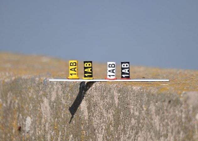
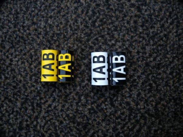
- white with black codes plus black with white codes
- yellow with black codes plus black with yellow codes
The rings’ size was the same as the one applied to large gulls. Each new ring had the same size as well as the size of the font engraved was identical.
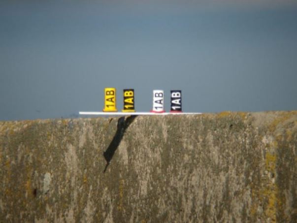


- Even when looked at from no distance, the letters and digits on the bright rings make impression as if they were smaller, though in reality their size is exactly the same!
- Along with the increase of the distance, the difference in the font size is getting more and more noticeable: the letters and digits seem thinner and smaller on the bright rings.
- From a distance of 50m the codes from the rings with bright background are definitely less clear. What is more, even at this distance similar letters/digits can be mixed up. It is hard to say whether the last sign on the white ring is ‘B’ or ‘8,’ while ‘B’ from the black ring is easily recognisable.
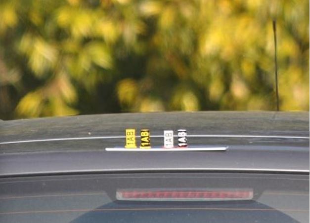
(Digiscoping with Nikon Fieldscope 82ED+ 30x wide eyepiece+Coolpix P6000 camera – distance 50m). - From a distance of 100m the above mentioned differences are even more noticeable.
(Digiscoping with Nikon Fieldscope 82ED+ 30x wide eyepiece+Coolpix P6000 camera – distance 100m).
Conclusions:
The black rings with bright codes are more readable than the ones whose black codes are put on a bright background. If you plan some subsequent ringing programmes, then, it is worthwhile taking the established relation into account. All the more so, because black rings with white codes are not applied very often, let alone black rings with yellow codes.